Nahan Receives Recertification of G7® Master Qualification

SAINT CLOUD, MN – December 4, 2020 – Nahan Printing, an award-winning provider of commercial print, direct mail, and digital solutions, is proud to announce it has received its annual G7® Master Qualification Recertification.

G7® is an industry-leading set of specifications from Idealliance® for achieving visual similarity across all print processes. It is a global standard widely used to measure the color accuracy on any output device. “The G7® Master Qualification tells Nahan’s customers that they can expect exceptional color consistency” said Tim Castellano, Nahan’s Color Technician. It allows Nahan to manage process control better, reduce make-ready, and improve overall efficiency in all aspects of our workflow. For our customers, this consistency also ensures uncompromising color according to their brand standards.

“The final product was beautiful. Print quality was exceptional.”

Print Buyer, Marketing and Fundraising Agency

“The G7® Master Qualification certifies that our color reproduction process is in control and can predictively produce the highest 4/C printing quality including match to the proof and consistent length of run color consistency” said John Klumb, Vice President of Sales and Marketing. “G7® certification is one of the cornerstones of Nahan’s Award Winning quality along with skilled craftsman and best in class inks and process materials.”

About Nahan

Nahan Printing is a Minnesota-based, independent, privately-held, world-class printer committed to providing end-to-end solutions that add value to our clients. Since its inception in 1962, Nahan has specialized in catalog and direct mail printing for industries such as retail, financial services, non-profit and hospitality. With a client roster of legendary brands, Nahan prints iconic work that represents the highest level of quality and innovation in the industry.

Mixing PMS Colors

I remember the days in a small Minnesota print shop, when I guessed at color by number of parts (Note, a part is actually a percentage of total weight) and mixed them up on a slab of granite. I used a razor blade to draw down the color and compare to the book.  Soon the “by guess” and “by golly” method changed to include a scale and a “quick peek,” which was a small rubber roller that would apply a measured amount of ink to the paper for a closer color match. Not very scientific but it worked.

How to Mix Colors

For point of reference, an easy color to mix is PMS 185 – the build of 185 is 75% Rubine and 25% Yellow.

Direct Mail

How to mix??

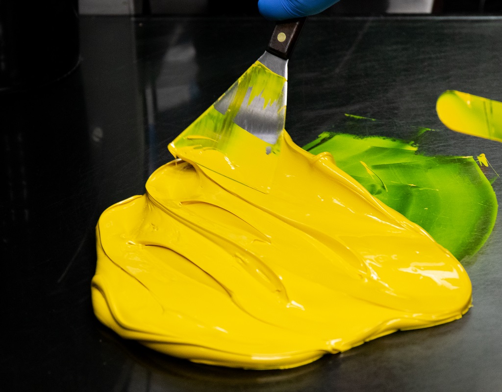
  • First, you will need an ink knife, sort of a longer putty knife, and a hard surface like glass or stainless steel.
  • Then, determine how much ink you need (that is a different story for another blog).  Let’s say two pounds.
  • Multiply  2 by .75 = 1.5 lbs. of Rubine Red (75% Rubine)
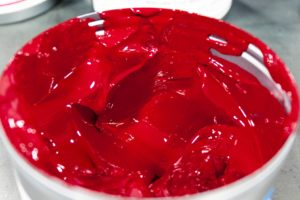
  • Weigh out 1.5 lbs. or Rubine red and put this on the mixing surface
  • Multiply 2 by .25 = .5 Yellow (25% Yellow)
  • Weigh out .25 lbs. mixing yellow and put on the mixing surface

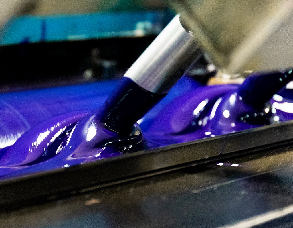
Just as in the old days you can put your ink on glass or granite or other smooth surface and mix them together. On a larger scale these colors would be mixed on a machine.

Do watch out for the comedian mixing up warm red!! See explanation below…

  • Once thoroughly mixed take a sample and draw it down on your paper and compare it to the PMS guide. Note: colors change as they dry, use a hair dryer or hot air gun to speed up the process, if you are mixing up UV ink you will need a light source.
  • Also, you must use the right matching guides to match your mixture. Formula Guides are based on the paper you are using coated or uncoated. Important note: Paper makes a big difference when matching color. Make sure you are drawing down the ink on the same paper you are going to be printing on..

Color Matching

If you are comfortable matching with your eyes, and the color looks good, you are good to go. The light in the area where you are reviewing color does make a difference. Are you viewing in 5k light? 5000 Kelvin light is the industry standard for viewing color.

Even though color has become more of a science with processes and standards, one can still weigh out small batches and mix them on a table and get relatively close.

Your ink company has become the expert with all the tools and standards for consistent larger batches of PMS spot colors. They will provide you will a drawdown of the color on the paper you are going to print on and provide spectral analysis if requested. (Some clients insist on the LAB having a Delta E of  +/- .02), and for good reason. Corporate branding is expensive to achieve and maintain for immediate brand recognition.

If you need more high-tech color matching, request a drawdown from your printer and ask for LAB print out to accompany it. (What is LAB? Check out X-rite blog)

If you know the spectral specifications for your color and you have a spectrophotometer, you can check your LAB, or you can compare the LAB number to the book (or your swatch) and then get an LAB +/-, which is also known as Delta E. Here is a great link about LAB and Delta E.

Commercial Printing

About Pantone

Around 1963, The Pantone (PMS) concept came along to help printers mix a color that would match if it were mixed in New York or California or any other state.

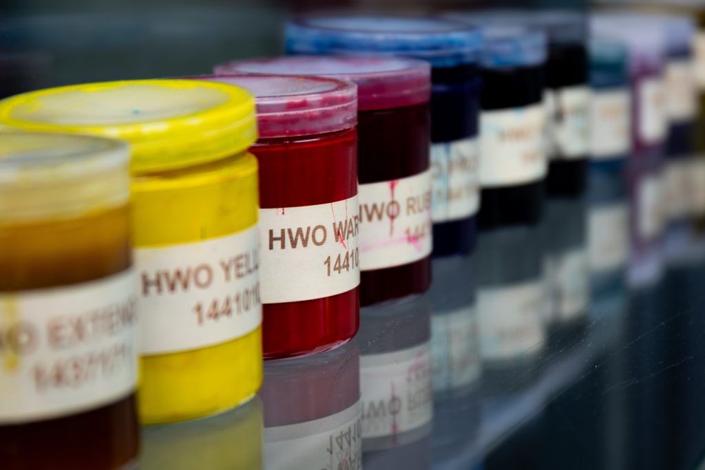
Originally, Pantone colors were mixed using a set of 11 base colors to achieve 500 colors and used a numeric system to identify them.  

Now, 14 basic colors are used as the building blocks that grew in to 1,114 available colors in the formula guide.

Base colors include Yellow, Warm Red, Rubine Red, Rhodamine Red, Purple, Violet, Process Blue, Reflex Blue, Green, Black and Transparent White (clear), Yellow 012, Orange 021, Blue 072 and Red 032.

Speaking of high-tech, Pantone now provides RGB, HEX and CMYK equivalent values for each color. You can look up PMS colors like 185 on their Pantone Web Site.

In 2007 Pantone and Xrite teamed up to become one company.

The new color guide with additional colors has 1,755 solid color choices.

There are other colors that can be used such as florescent or metallic inks; however, the standard color matching guides or PMS colors are the starting point and base of the main color matching system.

Pantone recommends changing your formula guide annually as paper can yellow and color can fade.

Nahan’s In-House Ink Company, INX

Nahan Printing has an in-house ink company called INX. They are industry-leading experts in color consistency and creativity. This allows Nahan to build custom mixed colors on site, provide quick turn drawdowns to customers, and create an ink mix that matches across all of our presses. This helps to maintain color consistency across components and help maintain brand standards.

Hot ink trick

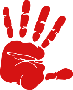
The HOT INK TRICK is an old spoof. As the press comedian is mixing ink on the slab, an office person (You) walks up and asks what you are doing? (S)He will respond: Mixing warm red, it gets real hot when I mix it. Want to feel? So you put your hand near the ink and the press comedian slaps your hand in to the ink…The old hot ink trick is not very funny 🙂

(Stay tuned for more printing inside jokes….perhaps next time I can fill you in on the paper stretcher or the dot gain. We usually keep them in the basement).


The 5 F’s of Color – The Challenges and How Nahan Achieves Color Matching


Nobody wants purple apples or green faces on their beautifully printed products. Nahan is proud to be a G7 Master Certified Facility and we also have two G7 Experts on our team. Color matching is just one of the ways that Nahan ensures a quality piece on every single product that goes through our doors. Let’s explore color matching and how Nahan deals with challenges regarding color.

Note: G7 is an international standard for ensuring color matching across multiple platforms.

What is the most challenging part about color matching on press?

Well, let’s just say there are many. Some images are a challenge without having to share the spotlight with other images. For example, a fresh cut steak could look inedible if not done right. Often times, the most challenging are the ones you want to look the best.

Which ones are most challenging?

Here are what we like to call as the 5 F’s: Flesh tones, Fashion, Furniture, Fur and Food. These are challenging because if a little off-color, furniture can look cheap and food can look unattractive.  Of course, these images may be your focal point and not getting them right can tarnish your brand.

Color matching

While on their own they may not be challenging, some images can collectively pose serious problems for a printer. Once a color is set on the first press form, all subsequent press forms are then driven by that first form. If there are crossovers, there could end up being some significant compromises.

Note: A crossover is one image running across multiple pages and possibly multiple press forms.

Color matching

How do you deal with them?

First: Prioritize your images and press forms

  • Go to your printer and do a “Press Check,” approving color on press.
  • Consult with your salesperson, look at all the forms and decide which one to start with – probably one with a couple of crossovers.

It is easy to be tempted to start with a form that has a bright color, corporate color or someone’s favorite photo and push the ink to make it pop. However, it is important to be careful with this. The next form may be a neutral and crossover to that first form and you may end up with a spoiled image.

Second: Make sure you are running to strict standards and specifications such as Gracol/G7

The use of real estate on the press sheet can be a challenge since different ranges of colors need to run in-line with each other. Perhaps it is fruit running in-line with flesh tones, or furniture running in-line with jewelry, which makes one image more difficult to hit your desired color.

  • Often there are limited choices as to what you can do about these.
    • You could stop the press and have a color technician mask off and color correct a disagreeable color area, however, this can be very expensive.
  • You could anticipate certain colors being a challenge and run a spot PMS color.
  • Running to a standard helps ensure matching to proof.
    • Make sure if you are supplying a color proof that it has color bars and has been produced to a standard like GRACOL / G7 or FOGRA.

Third: Paper quality is really important

  • Paper grain gives the sheet stability.
    • This can affect registration, which can in-turn, affect color. As sheets distort under the pressure of the printing press, the registration can move. This can cause color to shift and images to slur.
    • A good quality stable sheet will help with critical color matches.
  • If you are using uncoated or matte papers, the right calibration curve for those papers is very important.
    • Your experienced color technician should control this.

Fourth: Presses need to be in good mechanical condition, with repeatable results

  • This may be out of your control, but you can tell if you have chosen a printer wisely by how clean the machine is, or by how much your team cares about their work environment. When choosing, ask about their press maintenance schedule. Often times, their response can tell you a lot.

Nahan as a Trusted Color Expert

Nahan has two G7 Experts and Color Technicians who are here for consultation and will be at press as needed to help ensure premium color. We regularly calibrate our machines to ensure our high standards are met. Our presses are maintained by experienced press crews at regular intervals and we have a full maintenance department to help ensure all the G7 calibrating time is achievable and print results are repeatable.

In the event of a difficult color, our G7 experts can often achieve desired results without color correction, but rest assured, they are here for you if it is needed.

Nahan is a G7 Master Printer which means we have calibrated certain equipment to G7 gray balance & neutral tone curves for proofs, Offset & digital presses.

Interested in learning more about Nahan? Contact us to learn more about our printing services.

Bio: Jim Hesch is the head of Customer Service at Nahan and a certified printing geek. (Always make sure you print with someone who is certified)…